The brief
What we were asked for.
Luxury real estate is sold on trust. A seller with a seven-figure home is choosing a person, and the website is usually where that choice starts.
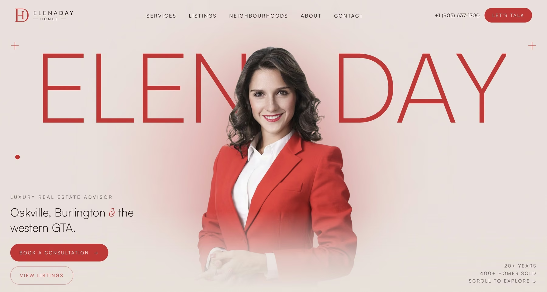
Elena's existing presence had the facts but no point of view. We were asked to design a homepage that feels like her: composed, direct and confident, with her name as the main visual.
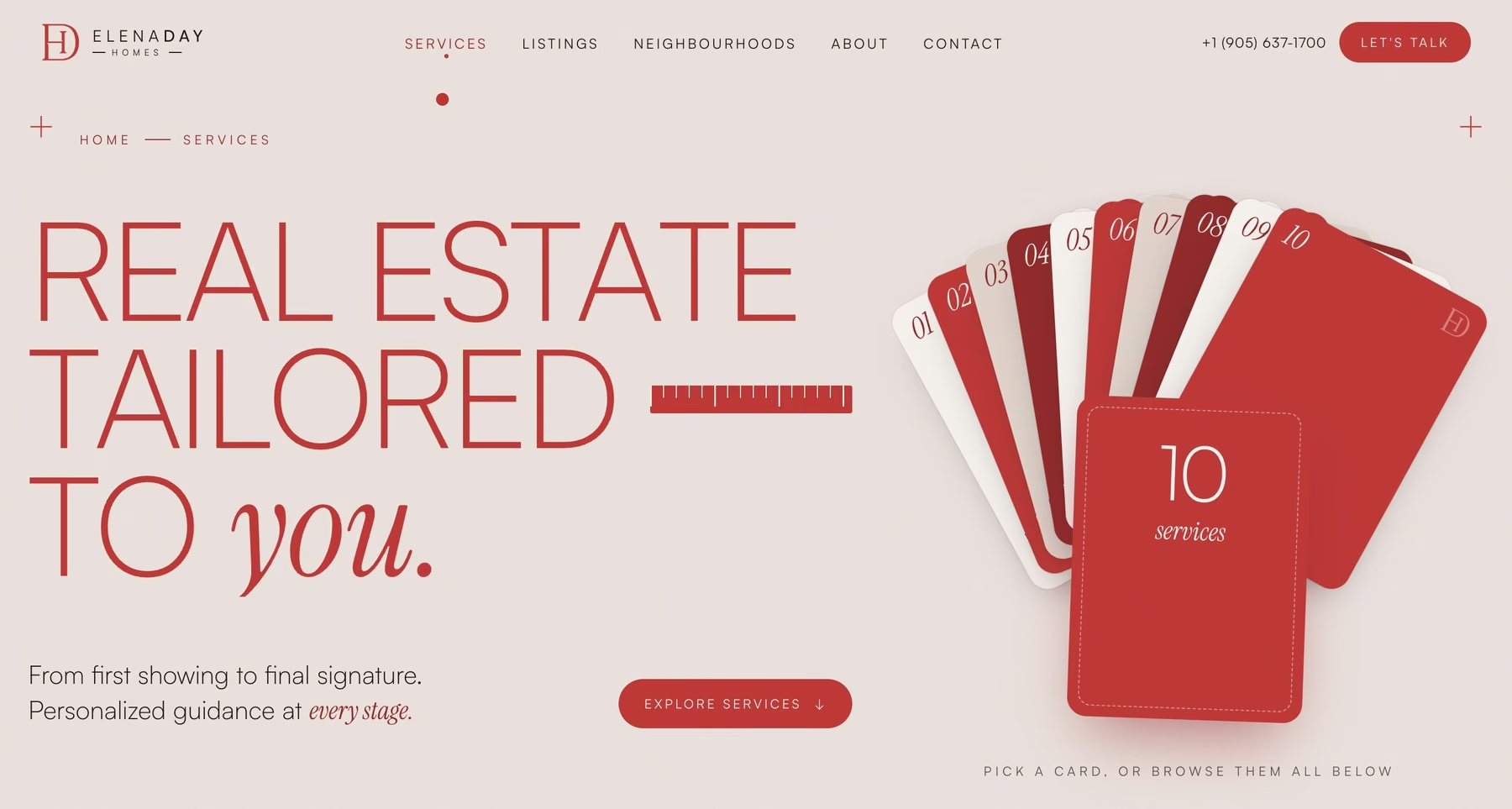
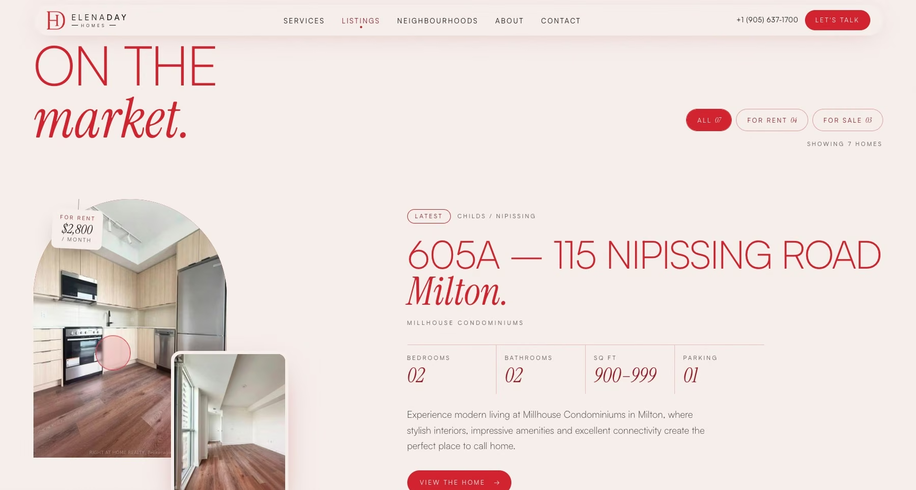
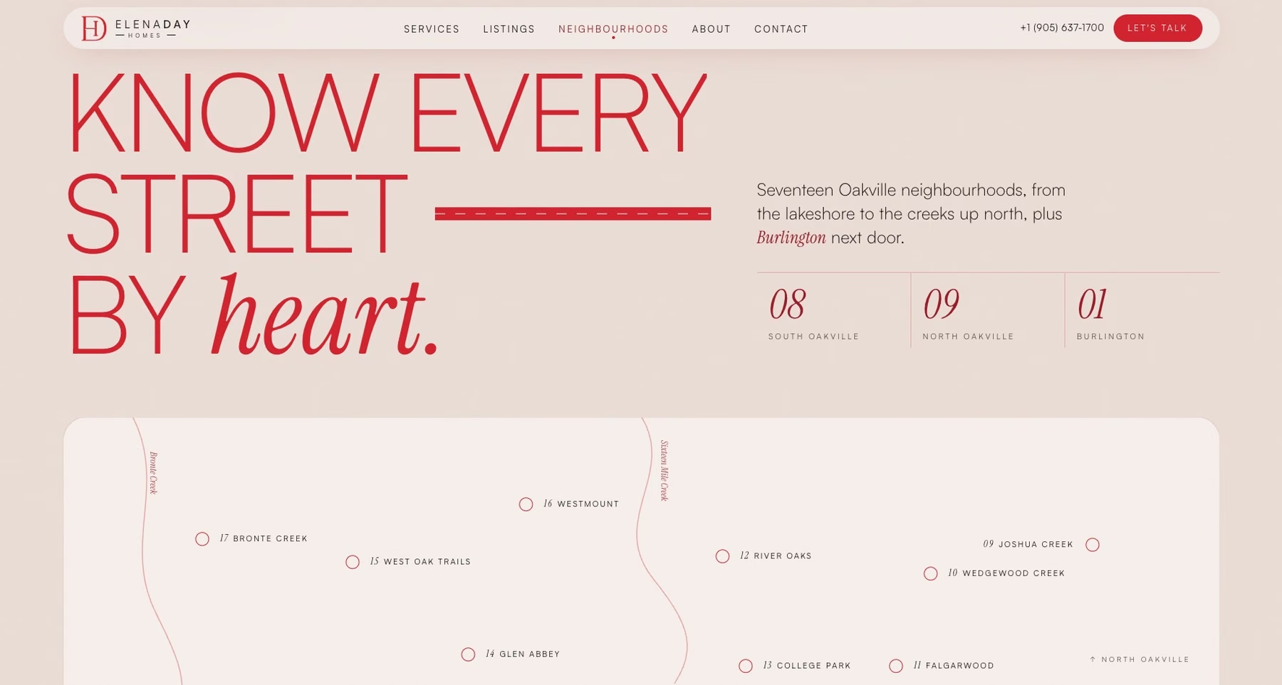
The work is a homepage experience. It sets the visual language that the inner pages (listings, services and neighbourhoods) are built from.
The build
What we built.
A hero built on her name
ELENA DAY is set in oversized serif capitals with her portrait layered through the letters. The brand red comes from her own identity. There is no stock skyline and no slider.
Editorial typography
Bodoni Moda for display and Jost for text, both self-hosted. The pairing reads like a property magazine, which is the company a luxury listing wants to keep.
Her record, counted up
Three figures animate into view as you reach them: years in practice, homes sold and transactions completed. Each has one line of context beside it.
Three areas of expertise
Current listings, services and neighbourhoods each get an image-led card. They are the three doors a buyer or seller looks for on an agent site.
Two ways to start
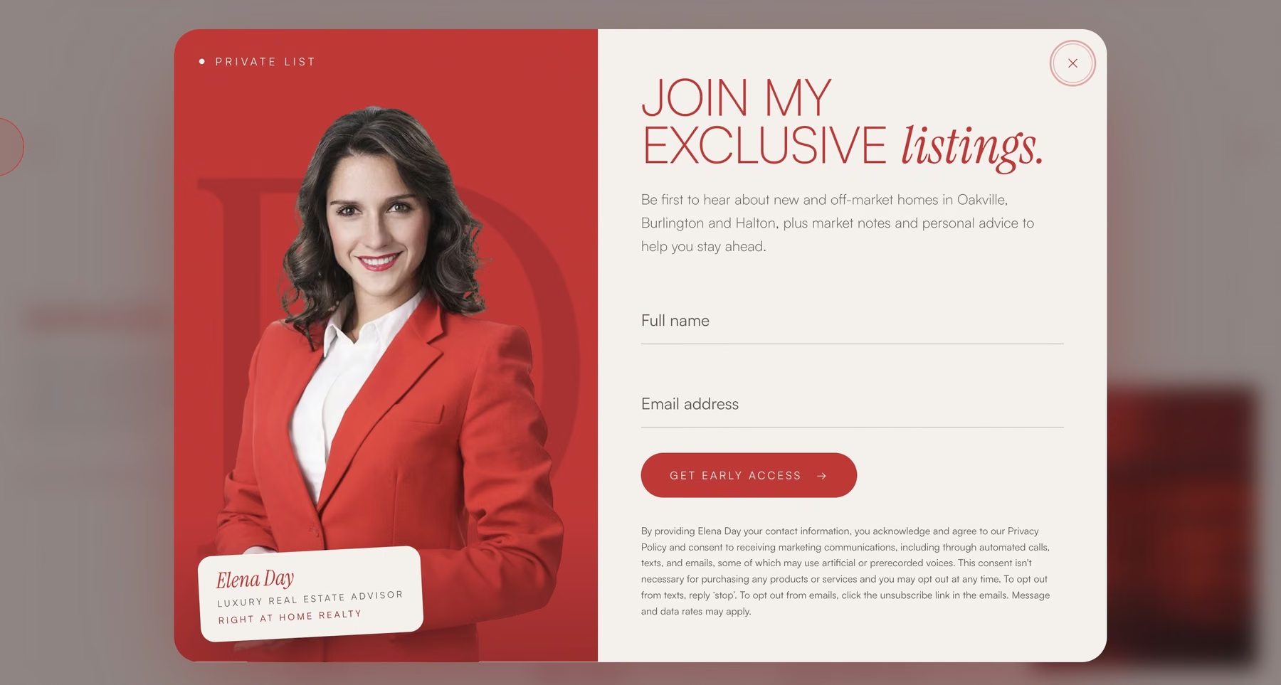
The page closes on a split call to action. Sellers are offered a pricing strategy for their home. Buyers are asked what matters most to them. Each visitor picks the path that fits.
Motion with a purpose
A short intro sequence, smooth scrolling, a custom cursor and buttons that lean toward the pointer. The motion is there to slow the pace down, the way a good showing does.
The real estate layer
Designed around how luxury clients choose an agent.
A high-end seller is rarely comparing features. They are deciding who they trust to represent the house. The page is ordered to answer that.
The person comes first
Name, portrait and a short statement of how she works sit at the top. Her philosophy is given in her own words: discretion, clarity, confidence.
Proof comes second
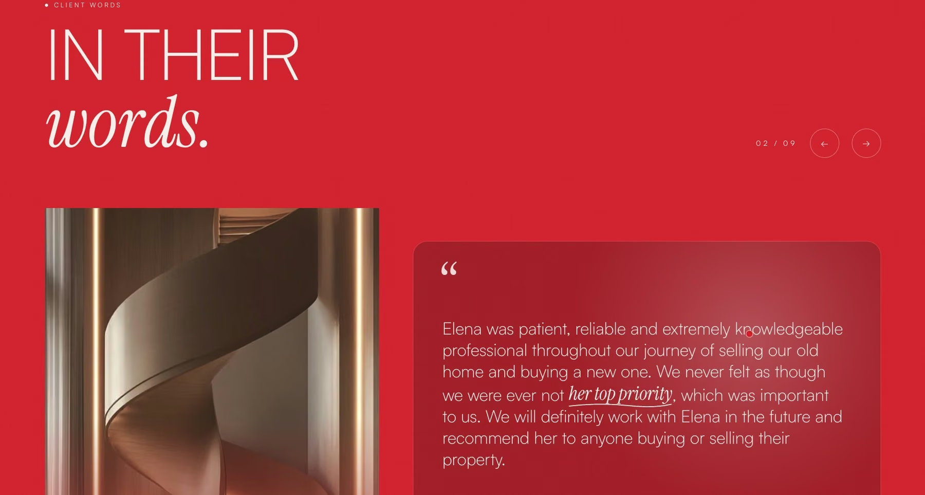
The numbers and client testimonials follow straight after the introduction, while the question of whether she is any good is still open.
Sellers and buyers are split early
A seller wants to know what the home is worth. A buyer wants someone to find the right one. The page gives each a separate entry point so neither has to read the other's pitch.
Contact details stay in reach
Phone, email and office address are in the footer of every view, formatted to tap and call on a phone.
Under the hood
Decisions worth explaining.
Type and a portrait carry the first screen
The hero depends on one portrait and a typeface, so it loads fast and looks like nobody else's. A full-screen property video would have looked like every other luxury agent.
One accent colour
Red is used for her name, the primary action and little else. On an ivory and ink page that is enough to make it hers.
Animation that can be switched off
The layout and the content hold up on their own. The motion is added on top of a page that already works.
Want something like this for your own market? See how we build real estate websites.
How the websites work